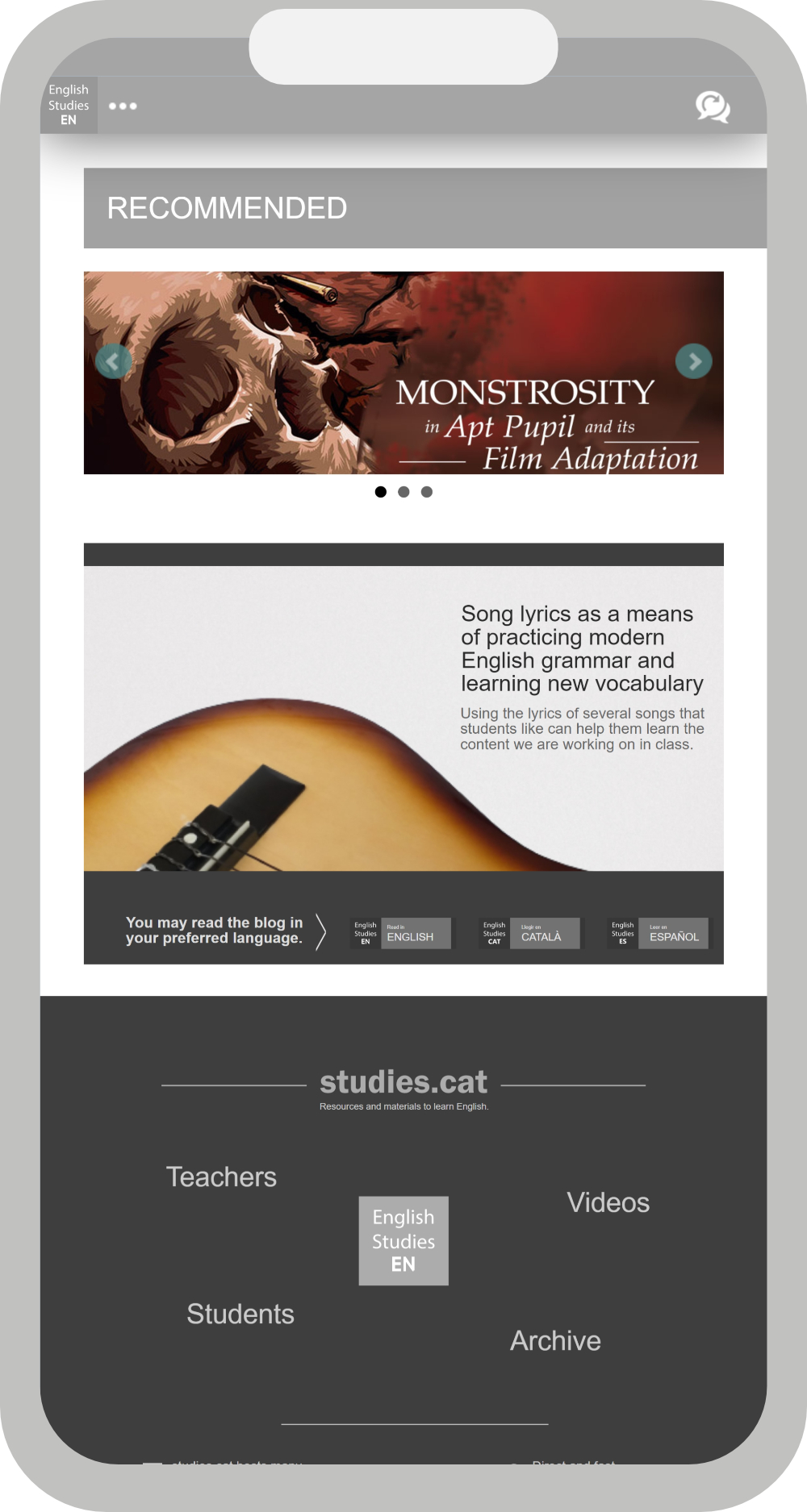
The site studies.cat is designed to run on any type of screen, from desktops to mobile phones, to tablets. The website should fit your screen and be extremely easy to use. See these examples of use:
In the main menu you will find three buttons:
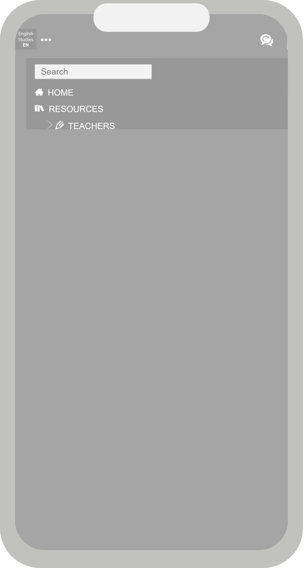
When you press the submenu ( ··· ) button, a menu that covers the entire screen of the web page appears. This menu lets you move around the website easily. Click on a link to go to that specific page.
To leave the submenu press the submenu ( ··· ) button again.
When you browse the site using a mobile device the pages are adapted to the screen so that text and images in the browser are suitable for reading.
